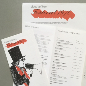
Stoke-on-Trent Festival
Dipping my toes into this professional design thing.
My first ever commercial job. Logo/posters/literature, everything print related. Went on to do a similar range on the back of this commission for the Windsor Festival.
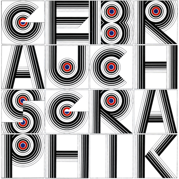
Hollenstein Creation
A foray in France.
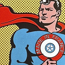
My first proper job - in Paris. World famous, multi-disciplinary practice run by Albert Hollenstein. Massive studios in St. Denis. Type, photography, advertising, graphics, interiors. Worked on global brands - as the resident Englishman. Et oui, en même temps, my French improved...
John Tann
Groundbreaking work in safes.
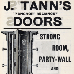
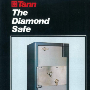
Back in London and a new identity for a long established security company. And it is still in use today. The safe designs were groundbreaking - the very cool Peter Wyngarde had one in his Department S office.

housetalk
Helping to modernise one of the most modern estate agents.
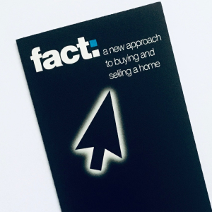
fact: housetalk was one of the first IT based estate agents in the country, way ahead of its time. We created the identity, marketing print, signage and website.
Calmlook
Making Barnsley’s nightlife scene iconic.
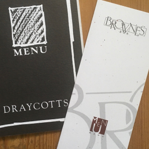
The nightlife scene in Barnsley was buzzing. A new look for some old pubs: The Pavillion, Brownes, Draycotts. Signage, menus, advertising brought the town to life - our iconic t-shirts were everywhere.
Foster's Lager
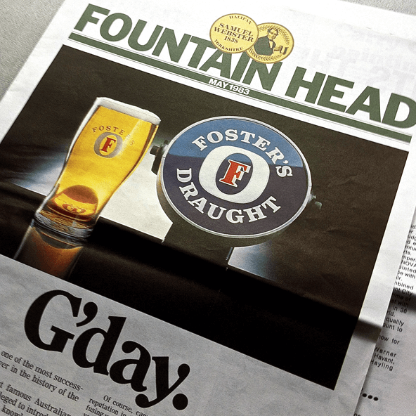
You didn't know Foster’s then, but you do now.
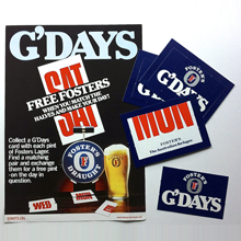
Part of the Webster's team that launched Foster’s in the UK. Brand development, POS design and extensive promotional campaigns soon made it Britain’s No.1 lager. G’days indeed.
Prestige
We smashed this.
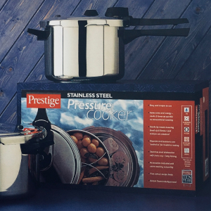
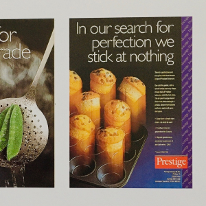
The once famous British kitchenware manufacturer commissioned a host of packaging projects together with related business-to-business advertising campaigns. No pressure, we coped quite well.

Ronseal
It did what it said on the tin.
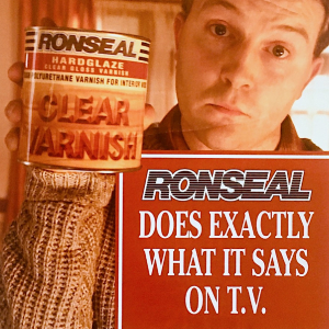
It does exactly what it says on the tin. And in the brochures. Print/point-of-sale/packaging for Ronseal, Colron and Thompson’s Water Seal. Somewhere along the way I coined this line. You may have heard it.
Malibu
Special edition bottles.
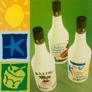
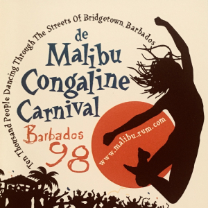
Local glass manufacturer PLM printed bottles for Malibu. Artwork was all ours. We created these commemorative, special edition designs for them in conjunction with their design department.
Black & Decker
Doing it differently.
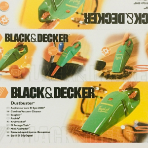
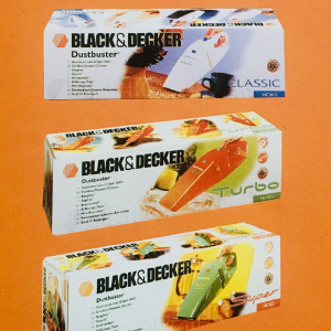
European packaging range for their housewares division. Groundbreaking at the time and very different from the rest of the market, we worked through concepts, artwork, photography and repro - a clean sweep.
Indie Joze
Branding an iconic bar.
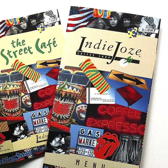
Iconic Leeds bar and eatery. It’s great when you are totally in tune with a client. Many intrepid trips to this once famous bar/restaurant in the Victoria Quarter Leeds creating graphics, menus and related material.
Carlsberg
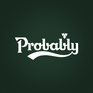
Probably the best work we ever did.
Worked for many Grand Metropolitan brands - including Carlsberg. This logo appeared on a range of promotional items and one match on shirts in a Liverpool FC away game when they weren’t allowed to use Carlsberg. Any good? Probably...

Ainsley Harriott
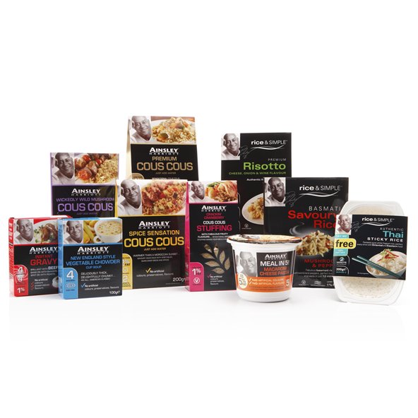
How can you sell packet soup to the masses?
We started with a blank sheet of paper, a name and some packet soup. Design including packs and identity of the now famous Ainsley Harriott food range which still retains many of these elements today.
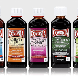
Covonia
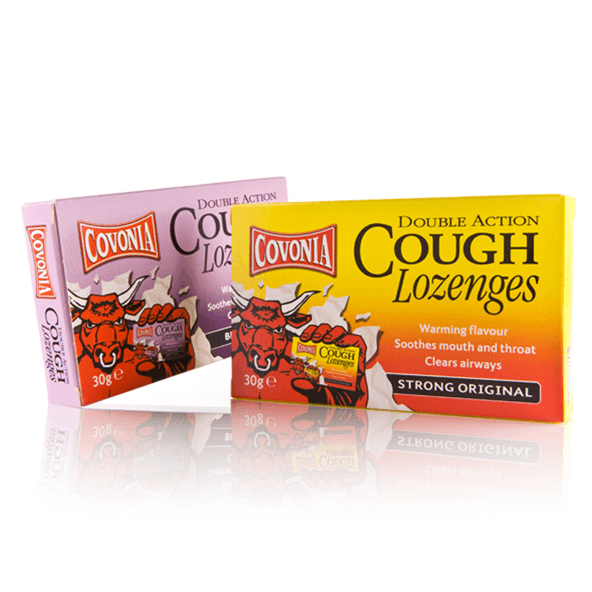
A brand with clout.
How do you redesign a brand so it looks like it has been around forever? Perhaps a bit like this. Briefed to create a new range that looks tried, trusted, reliable and what your mother used to give you. Weren't allowed to touch the logo. Stilll around today.
SeeAbility
Supporting a worthwhile cause.
We worked as design consultants to SeeAbility for many years. It was a pleasure to actively help and support such a worthwhile charity. Corporate identity management and development plus a vast array of literature and print.


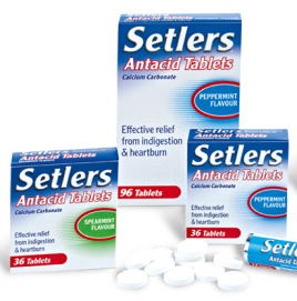
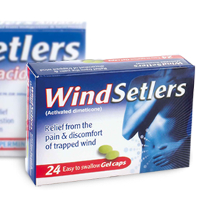
Setlers
Updating a famous brand.
A famous Thornton+Ross household brand that had been around for many years. Updated logo, new packs and colour ways gave it a refresh whilst retaining the core elements.

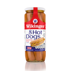
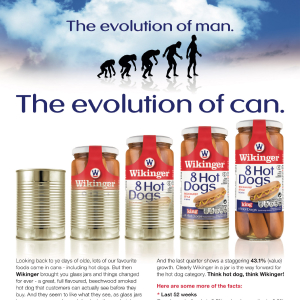
Wikinger
Europe's biggest hot dog maker.
Corporate identity / Packaging / Point-of-sale / advertising / website and everything visual for Europe’s biggest hot dog maker. Our work has aided their business to grow in spectacular fashion.
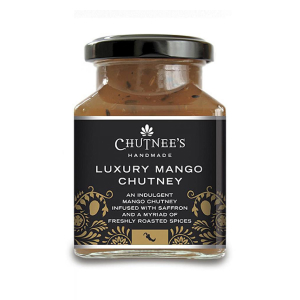
Chutnees
Spicing things up.
A new product development for a Yorkshire specialist chutney manufacturer. Brand name, logo and packaging for this very stylish range of products which launched in major retailers.
Craft Metropolis
Supporting a worthwhile cause.
Beer and family. Of my favourite things. A new London online craft beer business with logo design/development and website development in teamwork with Oliver Meade and Genius Division. And then, in 2019 there was a great new bar in Penge...
Pubs
Updating Barnsley’s nightlife. Again.
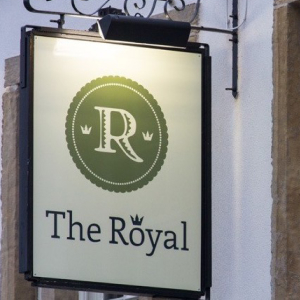
Full circle from my 80s involvement. Branding for some of the area’s most successful and stylish pubs. The Wentworth, Arcade Ale House, The Royal, The Talbot and The Anvil Arms. Lots of related print work too to complete the picture. Cheers!
London City Contractors
A new brand and website for an established London contractor.
A new business in London in need of a new look and a new brochure. And a website by Genius Division.

Nailmaker
Branding more beer.
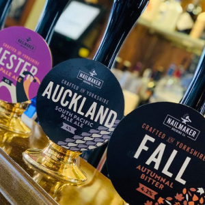
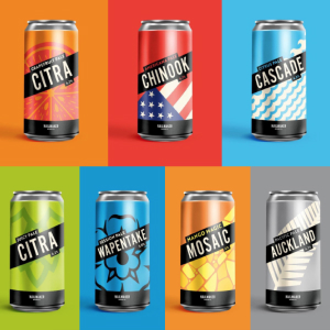
Branding and beer work for the lovely little brewery just round the corner from me.
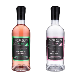
Waterton's Gin
Branding and bottle fun.
Branding and bottle graphics for the lovely little distillery just round the corner from me.
